On the surface, Facebook ads might seem simple, but anyone who has developed a campaign recently knows that Facebook can be a challenging platform for advertisers. Not only is your business competing with other businesses for your audience’s attention, but you’re also competing with your target buyers’ friends and family. That’s why it’s vital that your Facebook advertisements are visually appealing and able to catch the attention of your wandering audience.
Below, we’ve put together some of the top tips for creating fabulous looking Facebook ads.
Facebook Ads Tip #1 – Make sure your Facebook ads meet the image size requirements.
Facebook has different ad formats that all have different image requirements. If you want to get the most out of your Facebook advertising, you need to ensure that the size and aspect ratios for your ads are optimized. Let’s take a look at the requirements for each of the 5 main ad formats:
Single Image Ads
These are the most common type of Facebook ad and one of the easiest for Facebook users to view. This versatile ad format can be used for any Facebook objective except video views. To make sure that you are optimizing your single image ads, use the following specifications:
- Image Size: 1,200 x 628 pixels
- Image Ratio: 1.91:1
- Headline: 25 characters or less
- Text: 90 characters or less
- Link Descriptions: 30 characters or less
Single Video Ads
The single video ad is much like the single image ad, only it allows you to include a video instead of a still image. Videos can be very effective in capturing your audience’s attention. However, it’s important to note that Facebook videos are often watched without sound, making captions a must. Here are the specifications for this ad type:
- Video Length: Cannot exceed 60 minutes in length
- Video Format: .mov or .mp4 are preferred
- Aspect Ratio: 16:9
- Resolution: at least 720p
- File Size: 2.3 GB or less
- Headline: 25 characters or less
- Text: 90 characters or less
- Link Description: 30 characters or less
- Thumbnail Image: 1,200 x 675 pixels
Slideshow Ads
These ads utilize the slideshow format to showcase different products, services, or other assets important to your brand. These ads are also very versatile, working with every objective except the product catalog promotion. Here are the specifications for getting the most out of slideshow ads:
- Image Size: 1,280 x 720 pixels
- Image Ratio: 16:9, 2:3, or 1:1
- Headline: 25 characters or less
- Text: 90 characters or less
- Link Description: 30 characters or less
Carousel Ads
The carousel Facebook ad allows your business to create a carousel of up to 10 images or videos all on one Facebook ad with each linking to a different page. This is a great ad format for showcasing similar products or engaging visitors with additional media. This ad format works with many objectives and works well on mobile devices. Look below for the specifications for optimizing these ads:
- Image Size: 1,080 x 1,080 pixels
- Image Ratio: 1:1
- Headline: 40 characters or less
- Text: 90 characters or less
- Link Description: 20 characters or less
- Video Specifications: Same as single video ad format
Canvas Ads
Canvas ads are Facebook’s newest ad format. These ads appear much like a normal image ad. However, once the visitor clicks on the ad, the ad brings them to a full-screen experience that is both immersive and interactive that the viewer can navigate away from whenever they choose. This ad format is currently only available for mobile devices for a handful of objectives (boosting post, increasing brand awareness, increasing reach, sending people to specific location, increase video views, and increase website conversions).
These ads allow you to include a variety of multimedia components including images, video, carousels, text, buttons, and more. Therefore, the specifications will depend on what you choose to include in the Canvas ad. If you decide to use this ad format, you can visit Facebook’s Canvas ad help page to get started.
Facebook Ads Tip #2 – Keep it simple.
Once you’ve decided on which ad format works best for your Facebook ads campaign, it’s time to decide what the ad will look like. One of the most important things to remember when it comes to Facebook ad visuals is to keep it simple. You do not want to overwhelm the viewer with too much information or include images that detract from the ad’s message. Instead, you should aim for simplicity.
Here is an example of an ad from NatureBox that is simple, yet gets the ad message across to its viewers:

This ad uses an image that showcases more than one of the products that NatureBox provides. It gets at the idea that NatureBox has a selection of wholesome snacks without overwhelming the viewer. In addition, the ad displays the words “Free Trial” in white text over a bright orange background to capture the audience’s attention by highlighting the value that NatureBox will provide.
Facebook Ads Tip #3 – Use images that are relevant and positive.
The type of images that you use in your ads are also important. First, you need to make sure that the images you are using in your Facebook ads are contextually relevant. If your images are not relevant to your brand or offering than your message may get lost in the ad. Rather than using a random stock image in your ad, you should carefully choose an image that relates to your brand, offering, and brand message.
Here’s an example of an ad from a local Subaru dealership that is simple, but uses powerful and relevant imagery:

This ad is for a campaign that Subaru and REI launched to get consumers outside with their dogs. The image shows a dog looking out over a mountain. The background imagery is beautiful and relevant to the ad message as well as consistent with both partners branding. Though the companies could have just used an image of a dog for this ad, they instead chose an image that was able to better communicate the spirit of the campaign while also providing powerful imagery that would capture their audience’s attention.
In addition to using images that are relevant to your company or offering, you should also try to use images of people when possible, the happier then better. Humans are more likely to respond to human faces than they are product images or photos of natural spaces or inanimate objects. If you can include images of happy humans in your ad campaigns, it can help you better catch your audience’s attention and make a connection.
Here’s an example of an ad from Adrianna Papell, a dress shop:

Rather than just showing the dresses by themselves, this ad showcases a smiling wedding party in their dresses to help consumers visualize the final product. This ad communicates that the dress shop sells more than just dresses, it sells dresses that look beautiful when forever preserved in your wedding photography.
Though you want to use people in your ads, you still want to avoid resorting to stock photography or using irrelevant images that may hide your message. This is where video can be valuable in helping e-commerce brands improve their Facebook campaigns. Jet.com, an e-commerce company that provides different household products at low prices, created a fun video campaign for the holidays that was based around the Careculator, an online tool that helps you determine how much to spend on each of your loved ones. Here’s the video:
Notice that in the video, you have two friends interacting with step by step instructions on how to use the careculator. Note that this ad also keeps the content simple with a single-color background which leaves the focus on the two friends and their Jet.com package.
Facebook Ads Tip #4 – Don’t be afraid to use a little color.
Adding a little bit of color to your ads helps you stand out in the crowd of boring greys, whites, and tans. Though you don’t want to go overboard with your color as this can overwhelm your audience, you shouldn’t be afraid to use some colors throughout your ad to help catch your audience’s eye as they scroll through their Facebook feed.
The best way to find balance when it comes to ad colors is to keep the background clean and light while incorporating brighter colors throughout the ad. For instance, you might use whites and greys in the background with a touch of red, orange, blue, purple, or green in the foreground. This allows you to draw the viewer’s eye to the focal point of the ad, whatever that may be. Here is an example of a Facebook video ad from Wander Beauty that uses this color strategy:
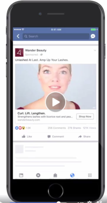
In this video, the content is very simplistic – there is a woman using mascara in the video to show how it works for a dramatic before and after. The background is clean and white, and the initial pop of color comes from the product. As the video progresses to show the woman applying the product, her shirt is the same color as the product packaging.
In addition to striking a balance between clean and light colors and brighter pops of color, you should try to use colors that fit within your branding. Using your brand colors within the ad outside of your logo helps you keep your branding consistent and can also improve brand recognition among your target audience.
In addition to the Wander Beauty ad discussed above, you can also see branded colors being used in this ad from Boston Sports Clubs:

The orange background uses the company’s signature orange to draw the reader’s eye to the ad. However, notice that the background isn’t busy. It is a solid color with white ad text. Keeping with the desire for simplicity, the main focal point of the ad is a woman wearing boxing gloves. The model’s shirt is a bright blue, but her peach skin tone and the black of the gloves along with the white text help balance out the bright colors used elsewhere.
Facebook Ads Tip #5 – Make sure your ad copy is direct and actionable.
So far, we’ve discussed what kinds of images to use when creating fabulous looking Facebook ads, but what about ad content? Whether you include text on the ad image or reserve the words just for the headline and ad copy, you will need to consider how your ad copy will impact the Facebook user.
Though images can certainly speak louder than words, your ad copy still plays an important role in your Facebook marketing ads. This copy can help clarify your message and compliment the imagery that you’ve chosen to help give consumers the final push or word of encouragement that they need to convert. Whether that conversion is a click, a download, an engagement, or a purchase, your ad copy can impact what users do after they have seen your ad.
The first step to writing direct ad copy is making sure that your value proposition is clear. How is your product or service different from others? Why should the user click on your ad or visit your website? What can you offer the consumer?
Sometimes your value proposition can be as simple as offering a discount or special promotion. If this is the case, make sure that you clearly outline the promotion in your ad copy. Here’s an example of an ad that clearly states the value proposition in its headline:

This ad from Club W is offering a special promotion for new members to get 3 bottles of wine for $19, a deal that is clearly stated in the headline. Not only does this provide clear ad copy, but it also follows the previous best practices of using simple design with small pops of color to grab the viewer’s attention.
Another element of effective Facebook ad copy is a clear call-to-action (CTA). Don’t be shy about telling Facebook users what you want them to do with your ad. Use specific active verbs like “click” or “download” to guide the viewer to the next step in the conversion process. Just like Amazon does in this Black Friday ad:

The ad has simple and direct ad copy that entices viewers to see Amazon’s deals. Not only does it tell viewers to “Check out today’s deals,” but it also has a “Shop Now” button that clearly tells users what they should do next and conveniently leads them to the next step in the purchasing process.
Final Takeaways
Facebook ads are an excellent tool to have in your digital marketing toolbox. If you want to get the most out of your advertising on Facebook, you will need to make sure that you have eye-catching ads that deliver a clear and powerful message to your target audience. Use the tips and examples above as a starting point for creating fabulous looking Facebook ads for your business.


